At Section, we have a #shoutouts Slack channel where we show our appreciation for each other. One recent shoutout stood out to me:

I have a few professional “superpowers” that I attribute a lot of my career growth to: I have a strong memory, I make good slides, and I can do a quick and scrappy data analysis.
Even though it seems basic, being able to do a COUNTIF really is a superpower. The ability to quickly clean and analyze a data set will make you better at every part of your job. But it’s easy to go a long time without learning this skill. (And if you’re far along in your career, it can feel embarrassing to ask for help!).
That’s why I’m sharing my quick guide on two basic data skills everyone should have.
Want to amp up your data skills in one week? Take our Intro to Data Analysis Sprint with TikTok data leader Sarah Evangeline Norman. Use discount code DATADRIVEN for 25% off membership.
Lesson 1: How to do a COUNTIF
Once you learn how to do a quick COUNTIF, you’ll use it all the time.
As the function’s name suggests, COUNTIF will count cells that meet a certain criteria that you set. The range is the set of cells you’re searching through, and the criteria is what it will count as a match.
COUNTIF(range, criteria)
For an example, let’s look at registrant data from our recent event on the Threats and Opportunities of AI.
I want to use this event to gauge interest in AI events by job level. To do that, I’ll use COUNTIF to count the number of registrants from each job level.
Step 1: Set up your criteria
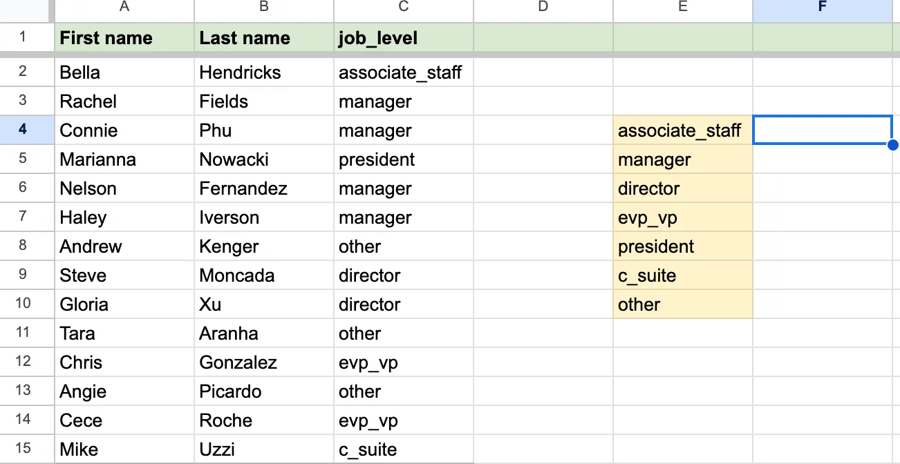
First, we’ll create a list in Column E of the criteria we’re looking for, and make sure the text and formatting exactly matches the way we’ve labeled our job_level data in Column C.
Step 2: Execute your COUNTIF
Next, we’ll write the formula for the first item we want to count: the number of registrants whose job title is associate_staff.
In this case, the range we’re searching is our job_level column, Column C, and the criteria we’re looking to match is associate_staff, E4. So our formula will look like this: =COUNTIF(C:C,E4)
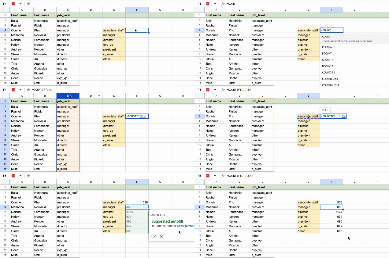
Now we have a clear view of interest in our event by job level, and we can use that information to better target the most interested segments for our next AI event.
Lesson 2: How to create a pivot table
Making data-informed decisions means dealing with a lot of spreadsheets. Being able to set up a quick pivot table to help you clearly visualize the data is a game-changer for your analysis skills.
Step 1: Identify the question you’re trying to answer
Before you set up your table, the first thing you need to know is what you’re actually trying to do with the data in front of you.
For example, let’s say you’re a marketer updating your social media strategy for Q1. Your team has been focused on growth lately, so you want to prioritize posts that have a wide reach: this tells you that impressions is a good metric to look at.
Step 2: Set up your pivot table
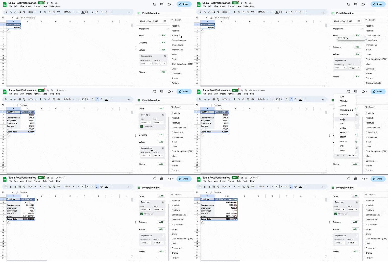
Now that you know what you’re looking for, you can dive into the data. Open up your dataset of social post performance, click the top left cell to select all your data, and then go to Insert > Pivot table to create your table.
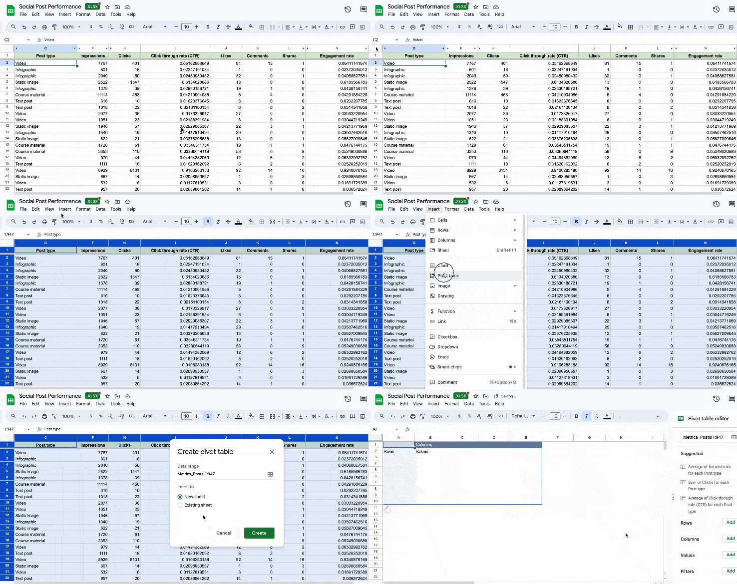
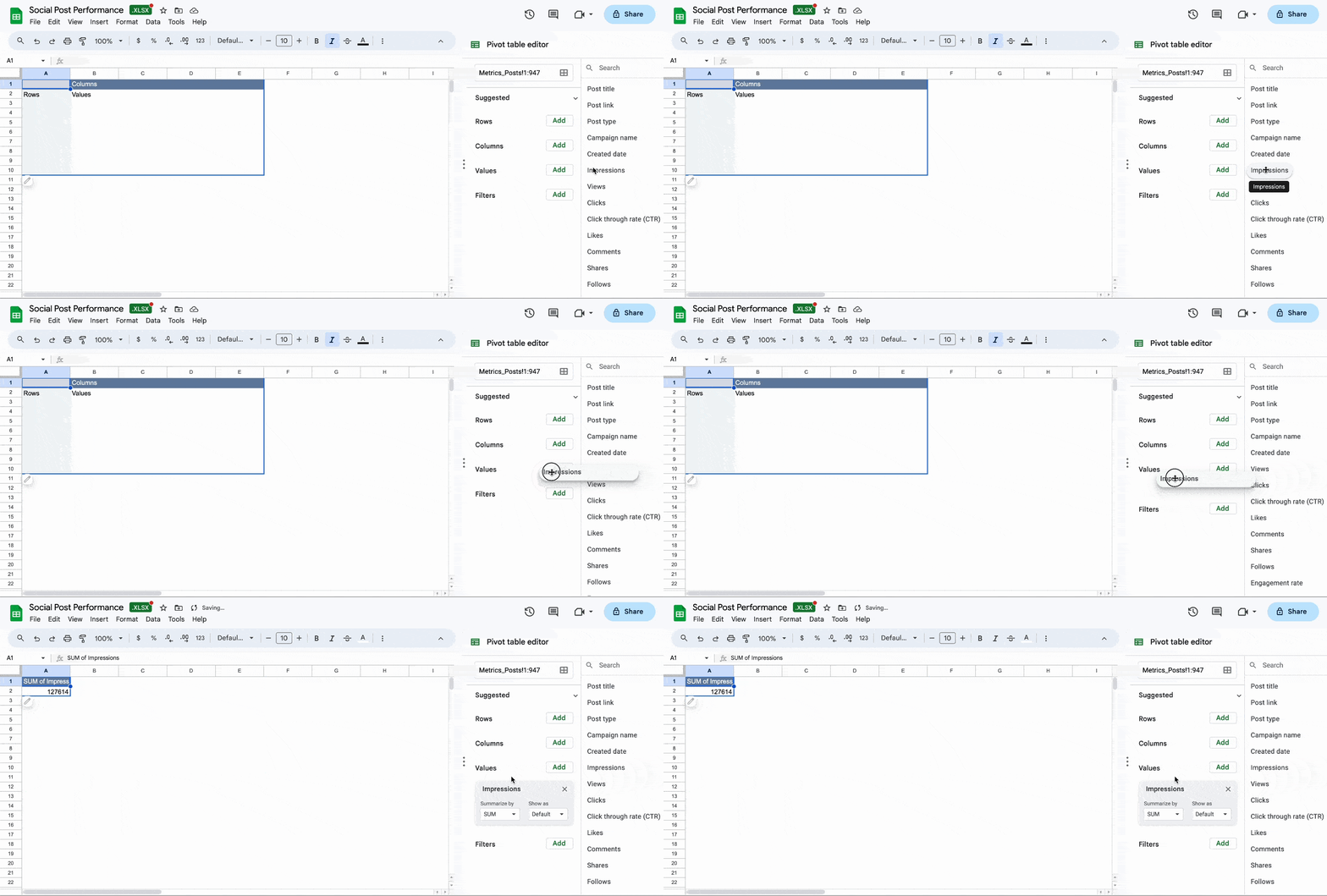
Now you’re ready to populate your pivot table with data. On the right side of your pivot table, you’ll see four fields: Rows, Columns, Values, and Filters.
You’ll use the value field for the main variable you want to measure. Since I want to know which posts have the best reach, I’ll drop Impressions into the value field. This will give me a sum of all impressions.
Step 3: Cut your data
Now for the interesting part: to see which types of post perform the best for impressions, I’ll cut the data by post type by going back to the pivot table editor on the right side of my screen, and adding the Post type variable to Rows.
This cuts impressions by post type, which is helpful, but doesn’t account for the fact that we don’t run an equal amount of each post, so even though static image posts have relatively low impressions, that could just be because we run less static images than other post types.
Let’s go back to the Pivot table editor, and summarize our impressions by Average instead of Sum. Now we have a better idea of how each post type performs on average, and we can see that our Video and Course material posts are our most successful.
Spend half an hour practicing your data skills and I guarantee it’ll be worth it. If you’re ready to really make data your superpower, take our upcoming Intro to Data Analysis Sprint with TikTok data leader Sarah Evangeline Norman. Use code DATADRIVEN for 25% off membership.


